 Data comes to us in many forms, and often our biggest challenge is translating it from the form it came in into the form we need it in. Date-based data is especially challenging – there are days of the week, weekly totals, months with different numbers of days, and holidays that land on different weekdays each year. This article is part of a series that will help you work with date-based data in Excel to get it into the formats you need.
This tutorial will teach you how to convert weekly summary data into monthly total data by allocating the days in each week to the appropriate month of the year. Let’s dive in!
Continue reading How to Convert Weekly Data into Monthly Data in Excel
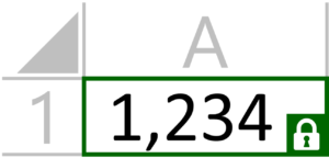 One of the most powerful features of Excel formulas is the ability to create absolute references that don’t move around when you drag to extend cell formulas or copy them to different places in your spreadsheet. Most Excel users figure out how to lock these references by either toggling through the options with the F4 key or using the
 We often use Pivot Tables in Excel to make large data sets easier to read. Pivots let us organize huge flat files by putting dates or categories into their own columns, making them easier to read.
 With the combination of INDEX and MATCH functions and Excel’s powerful array formulas (entered using CTRL+SHIFT+ENTER), we can already make Excel do the hard work of looking up data with multiple criteria for us. I wrote about it in the article
  The Excel functions for performing ranking and establishing percentiles are poorly described and confusing to use on the best of days. The PERCENTILE function doesn’t give the percent ranking of the item, but the instead the value at a given percentile (which might not even exist!). This makes it difficult to calculate even simple percent rankings in Excel. But what if you want to rank a sub-set of a list based on some criteria? In this tutorial, we’ll walk through the challenges of calculating percentiles and ranking values based on filtering criteria using a basic example.
 Excel’s basic functions, like SUM, AVERAGE, COUNT, MIN and MAX are indispensable for harnessing the power of spreadsheets, but they don’t always work well with filters and structured reports. By default, these functions tally every cell in their ranges, regardless of whether the cells are filtered or hidden. Many times in reporting, it is useful to limit functions to only consider rows that are visible on the sheet and ignore the hidden or filtered values. SUM, AVERAGE, and the like can’t do this on their own. Fortunately, Excel has a function called SUBTOTAL that will consider only visible or filtered rows in its calculations, and it can perform all the operations mentioned and more! This tutorial will walk though the use of the SUBTOTAL to sum a filtered data table…
  Excel’s Stacked Bar and Stacked Column chart functions are great tools for showing how different pieces make up a whole. Unfortunately, the are somewhat limited, since they don’t automatically provide totals for the stack, and they don’t let you show the percentage contribution that each piece provides to the whole (like you can with pie charts in Excel). The good news is, there are work-arounds for displaying total volumes or dollars at the top of a stacked chart and percentages for each of the pieces. This tutorial will walk through the steps to get you results like you see in the image.
 Excel’s built-in chart types are great for quickly visualizing your data. The horizontal bar chart is a great example of an easy to use graph type. Sometimes, though, it can be useful to call attention to a particular value or performance level, like an average or a min/max threshhold. In that
  Excel has some great basic charts and graphs build in, which makes it easy to build visualizations of your data. They are functional, but they don’t give a very professional look to your data. To make your presentation, website, or sales pitch really make a good impression, you’ll want to find a way to improve on the default charts. Even a basic line chart can be given a cool makeover with better colors, axes, and shaded background to make it stand out. These touches can give the boring old graphs a fancy new look. Here’s how to make a better line chart in Excel…