Quick Navigation
Creating the Chart
Now that we have our data updated with the average column, we can create the chart. Select the cells you want to be included.
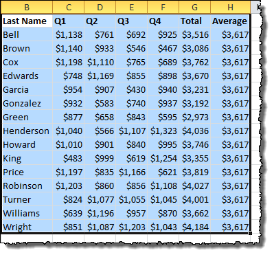
Under the Insert menu tab, in the Charts section, click the Column button and choose a basic vertical column chart.
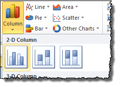
At first glance, our bar graph isn’t off to a good start.
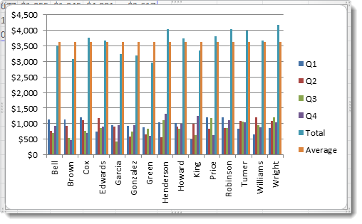
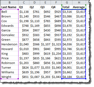
The chart has too many columns of data to display clearly. Let’s narrow it down to just the Total and Average columns. With the chart selected, click one of the left corners of the blue selection box (blue represents the data points), and drag it to the right until just the last two columns are selected.
Now the chart is looking a bit better, but we still need to change those averages to a line.
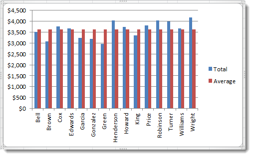
Right-click one of the red bars in the Average data series on the chart. In the menu that appears, click Change Series Chart Type…
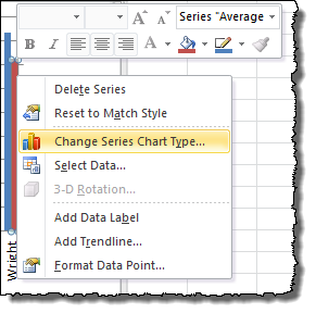
Then choose a basic Line chart from the Change Chart Type dialog and click OK.
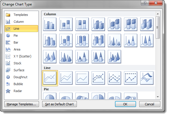
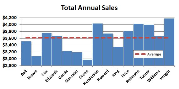
We’re basically where we want to be! I made a few extra cosmetic adjustments…
I deleted the Total line from the legend by clicking until just “Total” was selecting and pressing Delete on the keyboard.

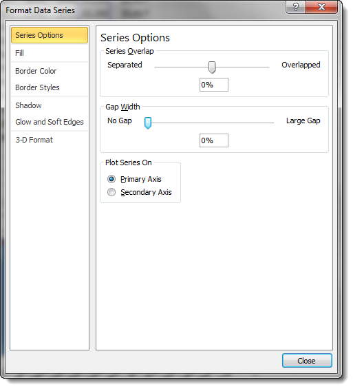
I moved the bars closer together in the chart by double-clicking one of the blue Total bars and setting the Gap Width to 0% in the Format Data Series dialog.
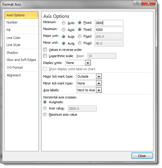
I set the y-axis to focus on the difference between the bars rather than showing from zero to the maximum value. This is possible by changing the Axis Options once you double-click the y-axis.
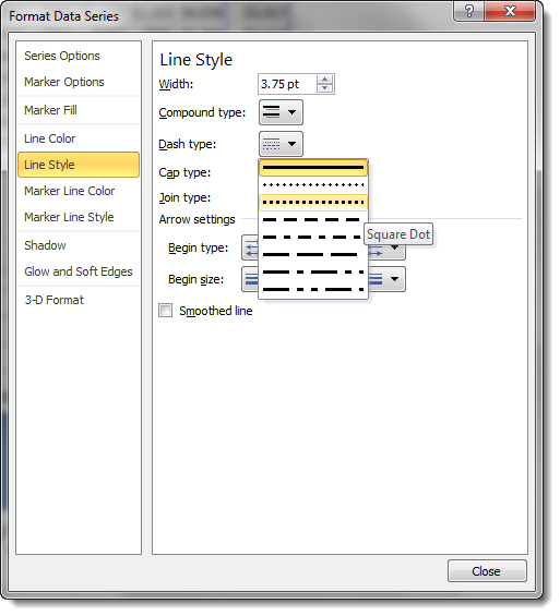
Finally, I made the Average line a dashed line by double-clicking on the solid red line and choosing Line Style from the Format Data Series dialog.
That’s it! You can use this technique to add any guide line to a bar-type chart, whether you want an average, a maximum and minimum bound, or last period’s figure.
This was very helpful. It taught me exactly what I needed to know.
Is there any way of hiding that average column from the table, because having column entirely of one value is a bit … lame. And when you try to hide the column by the mean of right clicking and chosing “Hide”, data from graph (line) also disappear.
Hi Budbreaker,
Excel is a bit weird about hiding columns in charts. You’re right that if you chose to “hide” the Average column in your data, it will make the series disappear on the chart. If you are just looking to visually hide the column but keep the data in the chart, I recommend changing the column width to a small value like “0.1” to shrink it to near invisible. This should have the same effect as “Hide” but keep the data in the chart.
Neat trick you suggested. It should really do the trick. Thanks !
Hi. Thanks for the post, but what’s the trick when you have horizontal bars. In other words, I need to rotate my ‘ave’ line and having trouble doing so. Thanks.
Hi Dmitri,
Horizontal bar charts need a slightly different approach, but I’ve walked through the steps in a tutorial here:
How to Add a Vertical Line to a Horizontal Bar Chart
Awesome, took me 1 minute to figure this out while having spent about an hour trying to do it myself
Thanks for this! Great tutorial!
Andrew your posts are always helpful.
I have followed your steps exactly. I want a horizontal line for a company wide average on a vertical bar chart. Whenever I chose “change series chart style to a line, the line disappears entirely. I don’t see any horizontal line. What am I doing wrong?
It is there but is too small on the vertical scale to see… You can select it indirectly by choosing it from the drop-down in the Current Selection box of the Layout tab under Chart Tools.
Hi,
Is there any way to make the average line touch the y-axis on this chart without halving the first and last column?
Hi there
Is there a way of the chart automatically changing colour if below the average line? for example if the ave is 150 but you hit 145 it goes red, if 160 it goes green.
Cheers
This is not a Bar chart it is a Column chart