Quick Navigation
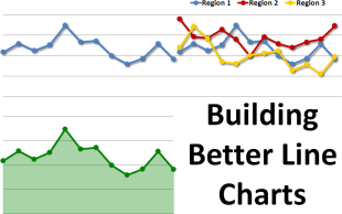 Excel has some great basic charts and graphs build in, which makes it easy to build visualizations of your data. They are functional, but they don’t give a very professional look to your data. To make your presentation, website, or sales pitch really make a good impression, you’ll want to find a way to improve on the default charts. Even a basic line chart can be given a cool makeover with better colors, axes, and shaded background to make it stand out. These touches can give the boring old graphs a fancy new look. Here’s how to make a better line chart in Excel…
The Default Line Chart
It may not have the polish we want, but Excel’s basic line chart is a great starting point for our cool new version. Start by selecting your basic data table with the series name on the left and the dates (or labels) in the top row.

From the Chart menu on the Insert tab, choose the Line drop-down and choose the first option.
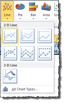
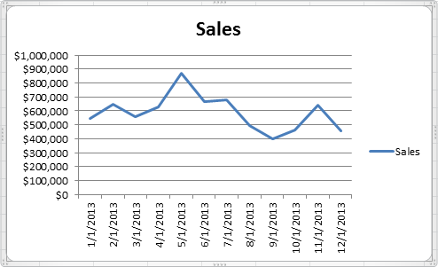
This is what we start with. It isn’t very pretty, but it would get the job done. Let’s see what we can do to make it look more professional.
Small Tweaks and Improvements
Removing the Legend
When you are working with a single data series, there is no confusion about what data is being presented. If the chart is titled “Sales” and there is only one line, the user doesn’t need to be told again that the line represents sales figures. Since it’s not needed, let’s go ahead and delete the legend.
Select the legend by clicking on the text or line graphic. When it is selected as seen below, press the Del key to remove the legend from the graph.
![]()
Formatting the Date Axis
When working with dates on an axis, it is often difficult to read the timeline. This chart only shows monthly data, so it doesn’t help to provide the day. The year will probably be shown in the chart title, so we only really need to see the month. It is possible to just show the number of the month, but it can sometimes be clearer to use the first letter of the month. To format the date axis, select the date cells from the original data table.
In the Format menu of the Home tab, click the arrow in the lower right to bring up the Format Cells dialog.
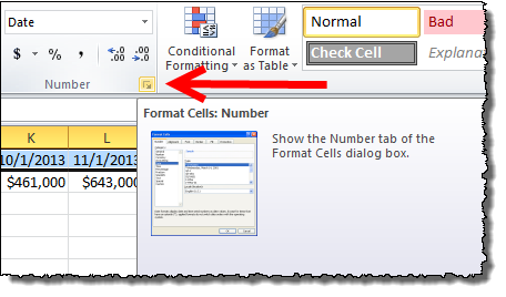
In the Format Cells dialog, choose the Custom category, and in the Type field, type “mmmmm”. To learn about other date formats, you can check out the Definitive Guide Custom Number Formats in Excel.
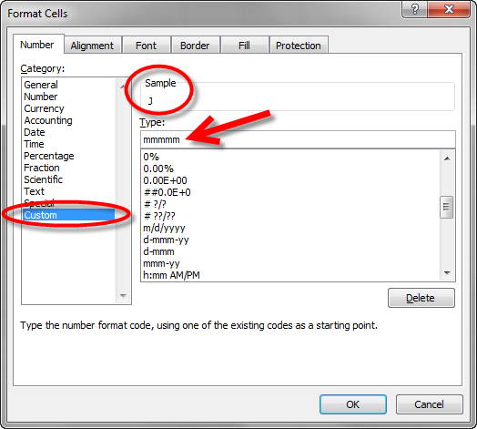
The new x-axis will be much cleaner to look at:
![]()
Fixing Line Margins
The default line chart in Excel adds margins before the first data point and after the last data point. Line charts (especially line charts with shaded areas – see the last section of the tutorial) often look better without these margins:
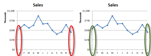
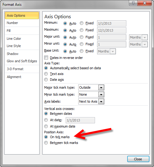
Double-click the date axis to bring up the Format Axis dialog. Under Axis Options, change Position Axis to On Tick Marks.
Formatting the Dollars Axis
The y-axis can also use some cleaning up. In the default view, the full thousands of dollars are shown, and there are too many lines crowding up the graph. We can ask Excel to show fewer lines and abbreviate the dollar values to make it easier to read.
Double-click one of the dollar values on the y-axis to bring up the Format Axis dialog.

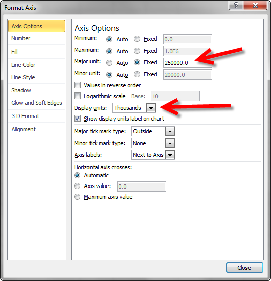
In the Format Axis dialog under the Axis Options, change the Major Unit from Auto to Fixed. Since our chart data ranges from 0 to $1m, it is probably safe to use $250k increments. In the Fixed field type “250000”.
Under Display Units, choose to group the data by “Thousands”.
These changes make the y-axis much easier to read:

Cleaning Up the Chart Line
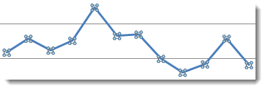
The default line chart in Excel has no data point markers. There is a chart type that uses markers, but most of the options are ugly and difficult to read. Let’s clean up the line chart itself…
Double-click the chart line to open up the Format Data Series dialog.
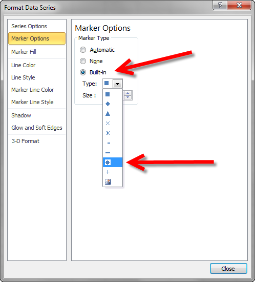
Under Marker Options, choose Built-In and select the Circle mark type. This is generally the most attractive default option, and you should only use something different if you have no other choice (e.g. too many data series).
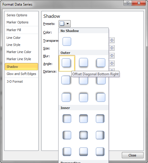
It also may improve visibility to add a drop shadow to the line chart. Under Shadow, choose the first Presets option under Outer.
A Better Line Chart
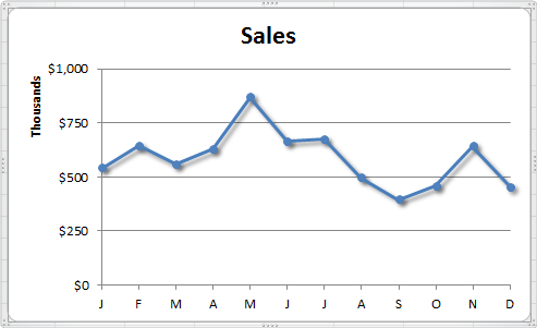
The result of these small changes is a much more readable, cleaner, more professional looking line chart:
You can repeat this process to add multiple data series with different colors to build a clean, cool chart for all your presentations and reports:
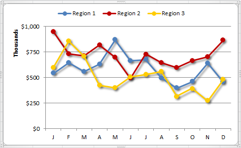
If you have only one data series (one line on the chart), there is one more step you can take to make the line chart truly stand out…
Adding a Shaded Area to the Line Chart
To make a single series line chart truly stand out, you can add a shaded area below the line. These shaded areas don’t tend to look as good with a drop-shadow on the line, so if you have added a shadow above, you may want to remove it again.
To do achieve the shaded area under the line chart, we have to trick Excel by adding another data series. Select the Sales row and copy it to the row below so there are two identical data series.
Then select the chart you made so the data table is highlighted. The date axis is highlighted in purple. The series name is highlighted in green. The data points themselves are highlighted in blue. Drag the corner of the blue box down to include the second data series.

A red line will appear on top of our blue line on the chart. Click to select the red line. Right-click and then choose Change Series Chart Type from the drop-down menu.
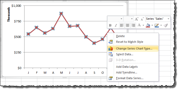
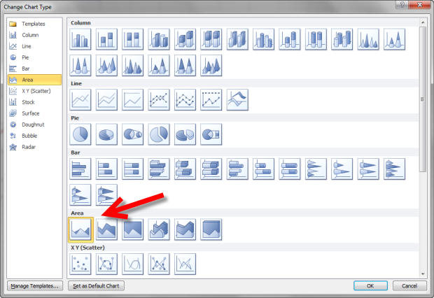
In the dialog box that appears, choose the first type under the Area category.
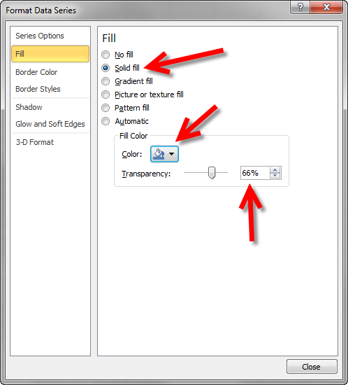
Double-click the red area on the chart to bring up the Format Data Series dialog.
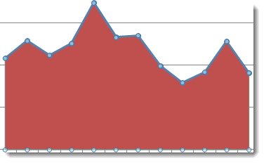
Under Fill, choose Solid Fill. Under Fill Color choose the same color as the line in the chart. Change Transparency to 66%.
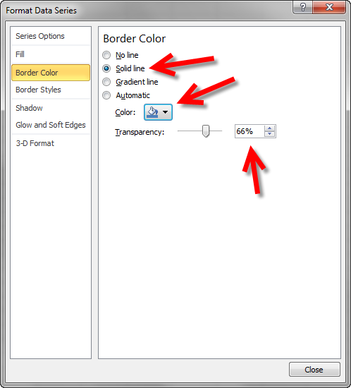
Under Border Color, choose Solid Fill. Under Fill Color choose the same color as the line in the chart. Change Transparency to 66%.
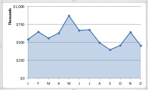
The final result will be an eye-catching chart that will make a great impression on presentations, publications, and other professional materials.
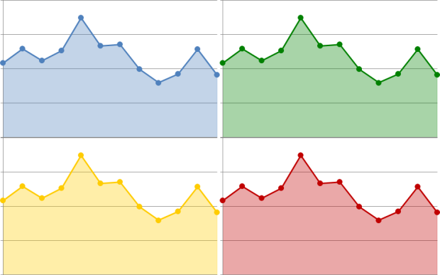
Feel free to experiment with other color schemes. Try not to use default Excel colors, as they are easy to recognize…
Nice post! I’d add that I usually reduce the grid line color to at least medium grey. It helps to bring to background and still keep the ‘line” place.
Cheers.
Great tip! Readability and emphasis are a huge part of making charts attractive and compelling. Dimming the gridlines (assuming they are still readable in your medum, be it print, projection, web, etc.) is a good way to do that!
The shadow added to lines and markers is really not helpful. it doesn’t matter much in the chart with one series, but in the chart with three series, the shadows of the lines make the chart excessively cluttered.
Ozzy’s right about using lighter gridlines. Microsoft finally figured this out with the improved default formatting of charts in Excel 2013.
Hi Jon,
Love your work… Thanks for the feedback! I think that most charts are in a constant battle between precision/readability and contrast/engagement, and shadows definitely lean towards the “pop” more than clarity. I’ve found that, depending on the use case, you might need more of one or the other, but in the end this is largely a stylistic choice.
It’s certainly a trade-off. I guess to get someone’s attention, it might be best of all to have a nice photograph where it will catch the eye, then have a tasty headline. By the time the first paragraph has someone’s attention, you shouldn’t need a lot of embellishment of the chart to maintain attention.
An alternate approach is to use smaller charts (the default 3×5 size in Excel is usually much larger than needed) and put it next to a relevant picture, say, the products in the regions.
Agree with Jon here, not a fan of those shadows (or shadows in general).
However, the line charts look great and are very similar to what we use in reporting.