Quick Navigation
Building the Bar Chart
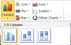
Now we’re ready to build the chart with multiple series. Select columns B through H. Choose the Insert tab and select Column from the Charts section, and click on the first bar chart option:
This is what we’re working with:
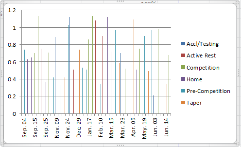
Now we need to make it pretty. Double-click on one of those slim bars to bring up the Format Data Series dialog box. Slide the Series Overlap bar all the way to the right towards Overlapped. Slide the Gap Width bar all the way left towards No Gap.
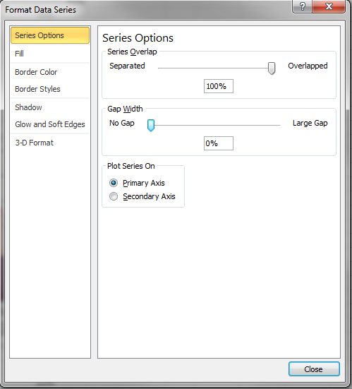
Click OK.
Looking better? Let’s see:
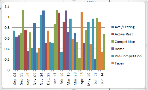
Now we have just a couple things to fix… The Percentage data on the y-axis is being shown as a decimal. Double-click on the y-axis to bring up the Format Axis dialog. Choose the Number sub-menu on the left and change the Category to Percentage, and set the Decimal Places to 0 (zero).
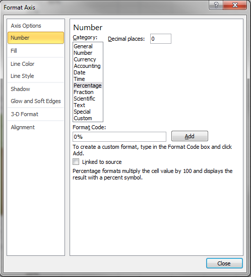
Click Close.
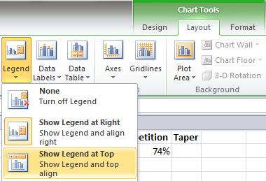
Finally, we can get a bit more readability by moving the Legend to the top of the chart and adding a thin outline to the bars… Select the chart and choose the Layout menu tab under Chart Tools and click the Legend button. Click on Show Legend on Top.
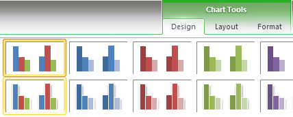
To add an outline to the bars, select the chart and choose the Design menu tab from the Chart Tools section. Click the drop-down under Chart Styles and choose the outlined bars icon.
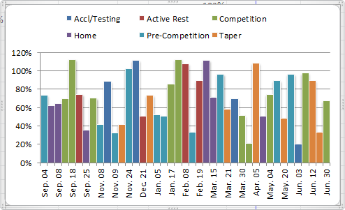
That’s it! Now you have a beautiful chart that is readable in seconds without any explanation, and all this from a data set that was as boring as it was impenetrable!
Hello!
In the every first picture there are only September and November dates in Column A, but then in the 5th picture the Dates in Column A have changed to include December, January, and February. I don’t understand how the dates got changed after reading the instructions a couple of times – feel free to email me.
Thanks for this Webpage on Multi-series charts. You helped to display the data much more efficiently and that’s Important when presenting data.
Joe Miyaki
jmiyaki@sehinc.com
Hi Joe,
The data was sorted to put all the data points from the same category next to each other. This makes it easier to build out columns for each category.
Andrew, thanks a million for this presentation. We have been bashing our brains out trying to figure out how to chart multiple species’ abundance over multiple sites in our intertidal survey of the California coast using newly acquired Excel skills and had not yet learned how to present data to Excel to achieve this result. Your effort on this page is very much appreciated. James.
Hi Andrew, Thank you so much for this. Like James I’ve been trying to figure out how to chart one species, Pearl-bordered fritillary, over 5 sites, over 5 years. Your tutorial helped me a huge amount. Thank you so much. Paula.
Hi,
I just wanted to thank you for this amazing guide! It really saved me time and gave me further insight into the powers of Excel.
-Ted
How would you set the Axis to recognize 3 different formats. My data includes whole numbers, percentages and currency depending on the selection.