![Chart Totals Above Stacked Bar Chart [IMAGE]](https://exceltactics.com/wp-content/uploads/2013/08/ChartTotalsLead.png) Have you ever noticed how standard charts in Excel never look quite “finished”? If you put in the basic data, you’ll get a nicely scaled X axis and Y axis, and all the bars will line up. If you use data labels, you can see exactly what the values are for each bar. But they’re still hard to read because Excel doesn’t provide totals! I’ll show you how to add clean, easy to read totals to your stacked column and bar charts…
Have you ever noticed how standard charts in Excel never look quite “finished”? If you put in the basic data, you’ll get a nicely scaled X axis and Y axis, and all the bars will line up. If you use data labels, you can see exactly what the values are for each bar. But they’re still hard to read because Excel doesn’t provide totals! I’ll show you how to add clean, easy to read totals to your stacked column and bar charts…
The secret to adding totals to your bar charts is simple – include a total line in your original data series! Select the rows and columns you want for your chart and select one of the stacked chart options from the Insert menu:
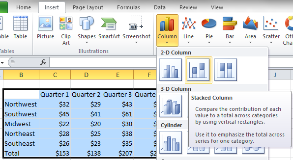
If the X and Y axis seem wrong, don’t forget to try the Switch Row/Column trick to fix the orientation. You’ll end up with a chart that looks similar to the one below. It’s going to have a big ugly total bar at the top, but don’t worry. That’s what we want!

Make sure the chart is selected and add Center Data Labels from the Layout menu in Chart Tools.
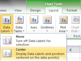
Now there are labels for all the bars in the chart, but the big total bars are still in our way. Select only the total bars in the chart. Then, go to the Format menu from the Chart Tools group. Click the Shape Fill drop-down and select No Fill.
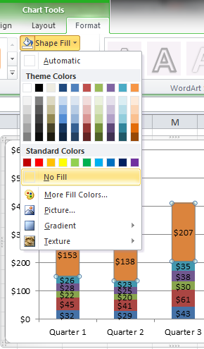
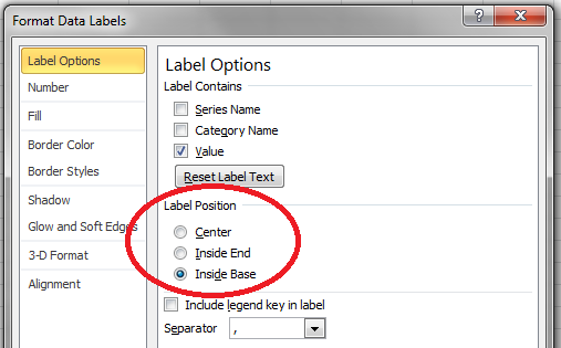
We’re getting closer! The total bar is now invisible, but chart is still distorted… Select only the data labels for the total bars. Right-Click one of the labels and select Format Data Labels.
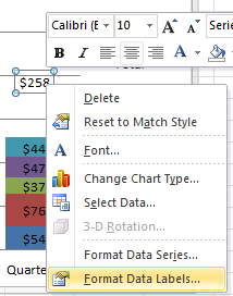
From the dialog box that pops up, choose Inside Base in the Label Position category, and then Close the dialog box.
Starting to look good! But now there’s a ton of white space above the bars in the chart. This is because Excel is still automatically scaling the vertical axis to fit the invisible total bars. To fix this, double-click the vertical axis.
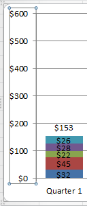
From the dialog box that appears, look under the Axis Options category for Maximum and change it to Fixed. Change the vertical axis maximum to a number that will still show all the visible bars and your total number. It will usually be exactly half of the default input. In this example, I changed it from the default 600 to 300.

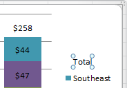
Finally, we just need to remove the little Total line in the chart’s legend. Click on the total twice to select it and press Delete on the keyboard.
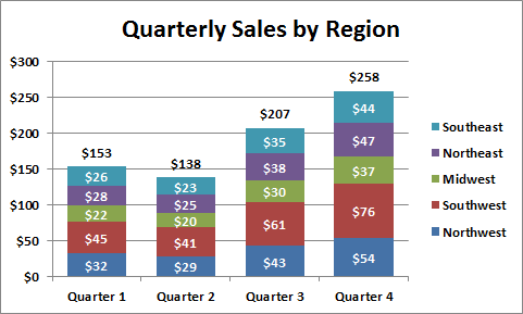
That’s it! You can play with the rest of the chart formatting to make it look how you like. I made the data labels bold and colored the interior labels white for readability. I also made the bars wider to fill up the white space. When you’re done, you’ll have a chart that looks far more professional than the defaults!
Nice trick …how come i did not think of that!
Another way to do it (if you don’t have too many columns) is as follows:
!. Click on the graph
2. Go to the Chart Tools/Layout tab and click on Text Box.
3. Click on the graph where you want the text box to be.
4. Then click in the formula bar and type your cell reference in there. Don’t type it directly in the text box. For your cell reference, you have to include the tab name, even if the cell is on the same tab as the graph. For example, =’ABC Company Q2 Sales’!$D$5
5.
Andrew, another way to display total without changing maximum for vertical axis. For series with totals you may just change type of chart from bar to line, and the scale is automatically adjusts.
have a nice day!
A
Also, if you just click on bar with the totals you don’t have display totals for every color….just the total all the colors
Thank you so much! This was such a quick fix and the chart looks so much better!
This is great.. I don’t quite understand why *lowering* the axis maximum resizes the stack upwards, but it works, that’s the main thing.
Only thing to alert users to is that hovering over the stack will still show a total value for the element that’s ghosted-out, but this seems a minor compromise.
How do you do this to horizontally stacked bar charts?
Thanks. Very straightforward and amazing technique