 Excel’s Insert Chart feature is usually pretty smart about choosing the data that you want for your graphs and other visualizations, but sometimes it seems to have lost its mind. Before you give up and manually select all those data series, try this quick trick to save your chart…
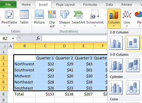
You know the situation. You have a perfectly clean data set and you want to put it in a chart, so you select the rows and columns and select a chart from the Insert menu:
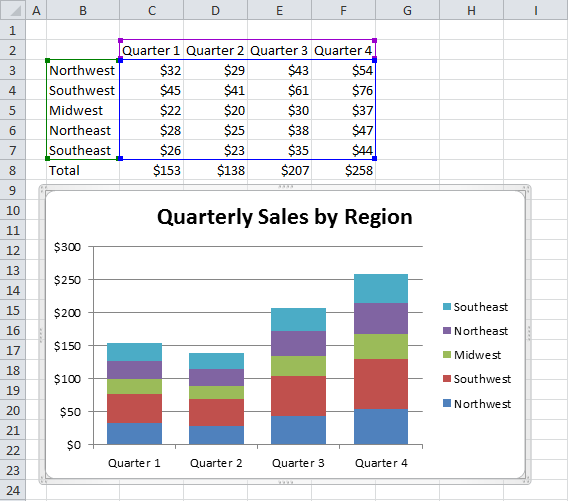
All the right fields look right, but Excel has gotten a case of the stupids and the chart isn’t what you wanted:
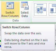
Sometimes, though, the problem is just a case of flipped data. This happens often enough that Excel has a feature to swap fields, turning columns into rows and rows into columns to fix the chart. All you have to do is select your broken chart, choose the Design menu from the Chart Tools group.
![]()
Then click on the Switch Row/Column button to right the wrongs on your beautiful chart.
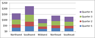
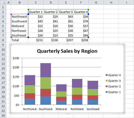
That’s it! Now your chart should look nice and pretty as you intended all along. No manual data entry, and no tedious tweaking! Your final output should look like this:
