Quick Navigation
Adding Percentages to the Stacked Column Chart
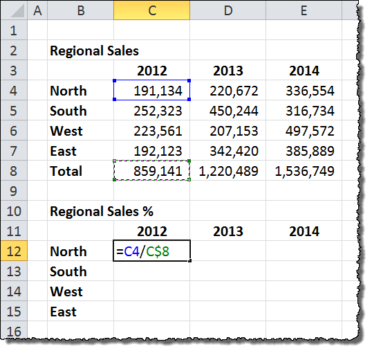
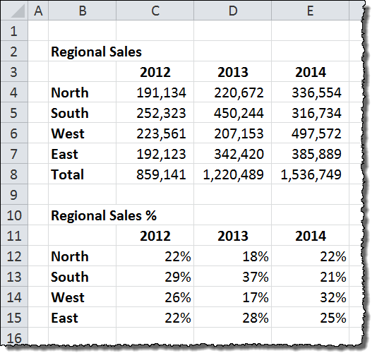
To display percentages instead of volumes on the stacked chart, we first need to calculate them by building another data table. Duplicate the table of volumes we used to create the chart in the first place, and enter a formula to calculate the percent of total for each region in each year.

In this example, the formula for the first region and first year is as follows:
=C4/C$8
The $ locks the Total row for the volume table so that we can drag the formula across and down to complete the data set. When you are finished, the percentage table should look like this:

fun little tip I came up with after using your great instructions:
You can add in the item and Percentage simply by using a Text() function.
Example:
Refer to both the Item cell and % cell
=Text(,”0%”)&”, “&
you then point to this string, and your chart will show both percent and item.
Can you explain your tip a little more? I am trying to apply it to my work but I am having difficulty. It sounds like it is just what I need. Thanks!
Does anyone know how to get a graphic symbol in the same cell with a percentage ? I really like it, but I can’t figure out how to do this.
Thanks for your help.
Jeanne
This is done with Conditional Formatting – usually located on your “Home” tab on your menu ribbon:
1 – Select the range of cells you want to have this style of formatting.
2 – Click “New Rule” from the Conditional Formatting dropdown menu.
3 – Select “Format All Cells Based On Their Value” in the upper part of the window.
4 – Select “Format Style – Icon Sets” in the lower part of the window.
5 – Select the appropriate “Icon Style” from the dropdown menu.
6 – Adjust the parameters so that the appropriate Value or Percentage will display the appropriate Icon.
7 – OK!
thanks for this tip. Instead of the little ball, I am using wireless bars and it looks fantastic.
happy new year
I’ve noticed an issue with the stacked percentage bar chart not adding up to 100% within Excel. Even in your illustration, year 2012 adds up only to 99%. Does anyone have a fix for this or does it require intensive quality control each time one of these is generated?
As i have couple of data where in as per the stock is the chart is ready but unable to show the percentage with the stock please help
Your solution for adding percentages manually is EXACTLY WHAT I WAS LOOKING FOR! It’s the best of all the cumbersome workarounds! Excel should just fix this dated and silly issue.
You are double counting your data. You don’t need to include “Totals” in your data selection. The graph looks like your company sold 3M+ units, when in reality it’s half that.
Hi Jay,
It appears you are looking only at the first page of a 7-page article… Read the rest and you’ll see it’s all part of the plan!
Andrew
Thank you so much!!! I’ve been looking for this for days and once I found it I immediately practiced your tips. Turned out very great. Thank you again!!
Hi, Hertriani.
Sorry I am new to all of this and I am having a little trouble following.
Which instructions did you use to create that graph that gives you a percentage stacked bar as well as a number.
In the hotel world I would like to have a percentage occupancy showing while having the average rate paid labeled above it. In the end it should look like what you created.
Thanks,
Bryan
hi Bryan, apologize for the delayed response cos I was not aware of your question until I got a notification email earlier today. I followed the instructions in this article, and made minor modification on the label setting. But basically it’s everything that is mentioned in this article. Feel free to contact me at hertriani@alaksir.net if you want to discuss this.
Can someone help me on this… I got to the last step but when I click on the data label there is already a formula in the formula bar since the chart is obviously referencing cells. If I delete what is in there and then select the desired percentage cell, nothing happens. If I leave the formula in there and try to add the percentage cell before it, the chart turns into a mess.
Any help would be great
Just double click on the data label and write = and then click on the cell containing the percentage
Very good. Thanks a lot.
I did a little vba code wich helps as well.
You just need to prepare the graph regularly (do not concerne about percentage)… when you get done, apply the code.
Sub GrafValor_LabelPercent()
Dim volMGDia(1000) As Double, c As Integer, x As Integer, vPerc As Double, n As Integer, vLabel As Double
For n = 0 To 1000
volMGDia(n) = Empty
Next n
ActiveChart.SetElement (msoElementDataLabelNone)
ActiveChart.SetElement (msoElementDataLabelCenter)
For c = 1 To ActiveChart.SeriesCollection.Count
If LCase(ActiveChart.SeriesCollection(c).Name) “total” Then
For x = 1 To ActiveChart.SeriesCollection(c).Points.Count
volMGDia(x) = volMGDia(x) + Val(Format(ActiveChart.SeriesCollection(c).Points(x).DataLabel.Text, “0”))
Next x
End If
Next c
For c = 1 To ActiveChart.SeriesCollection.Count
If LCase(ActiveChart.SeriesCollection(c).Name) “total” Then
For x = 1 To ActiveChart.SeriesCollection(c).Points.Count
vLabel = Val(Format(ActiveChart.SeriesCollection(c).Points(x).DataLabel.Text, “0”))
If volMGDia(x) > 0 Then
vPerc = vLabel / volMGDia(x)
Else
vPerc = 0
End If
ActiveChart.SeriesCollection(c).Points(x).DataLabel.Font.Size = 12
If vPerc > 0 Then
ActiveChart.SeriesCollection(c).Points(x).DataLabel.Text = Format(vPerc, “0%”)
End If
Next x
Else
ActiveChart.SeriesCollection(c).DataLabels.Position = xlLabelPositionAbove
ActiveChart.SeriesCollection(c).DataLabels.Format.TextFrame2.TextRange.Font.Fill.ForeColor.RGB = RGB(0, 112, 192)
ActiveChart.SeriesCollection(c).DataLabels.Format.TextFrame2.TextRange.Font.Bold = msoTrue
End If
Next c
Can you please share your example excel file with VBA code that works
This focuses on Stacked Bar Charts. I want a percentage but in a column bar chart not stacked.